Website Makeover

I’ve just re-built my website (and when I say ‘I’, what I really mean is ‘we’, in the sense that my partner did all the work and I sat next to him, making helpful comments….)
We used iWeb, the Apple’s web software, which is very easy to use and works well with other Apple software, like iPhoto. So easy, in fact, that I was using it to tweak the pages myself.
The only drawback is that it’s not very flexible when it comes to making your site search engine friendly but we found a solution to that, which is a free tool from Rage software.
Anyway, have a look and see what you think here.

Artists Emails

This morning I had an email from an artist asking if we’d be interested in showing his work. This isn’t unusual as I monitor incoming emails for a couple of websites I’m connected to professionally and we get a lot of requests to look at portfolios/ invites to private views/ links to artist’s websites, etc..

I have to say, though, that I am constantly amazed by how many people don’t take the time to do some, or even any, basic research. If you’re approaching someone you’ve never met, especially when you’re asking for something, then surely you should find out a little about them beforehand. At the very least, finding a name to address the email to would help – Dear Sir/Madam is definitely not the way to go.

For example, there’s not much point in asking if there are any job vacancies at a co-operative gallery, as only a couple of minutes on the website would show them that it is run and staffed by the artist members themselves.

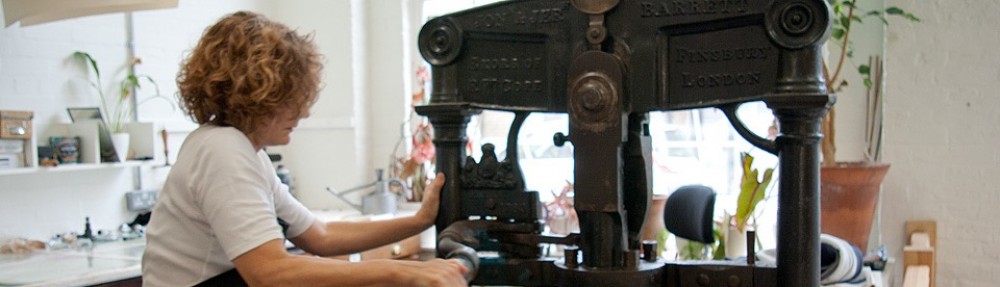
And asking if Half Moon Studio can show their work at the Affordable Art Fair is a waste of time, as a quick look at our website would reveal that we are five artists sharing a printmaking space, and not a commercial gallery.

I can’t help feeling that sending out these non-specific emails to hundreds (or thousands) of galleries and studios isn’t going to achieve much.

As for that artist’s email this morning – well, he wanted us to look at his paintings. Just a quick look at the name of the gallery he was approaching would have shown him that we only deal with artist’s prints…..

Giving It Another Go….(The End)

Here is the final block, inked up in pale blue and a thin yellow glaze. In the end, I decided to cut it up into sections so that each area could be inked up separately – then I could just push it back together again for printing.
I probably should have cut another block entirely for the yellow but I felt it was important to get the print completed this year.


Anyway, here is the final version with the barely visible alterations.
Still, I’m happy with it now- and thanks to all of you who took the trouble to comment on my progress. It’s not easy to view your work with any detachment, especially when you’d been under the impression that you’d finished it once before…..


Giving It Another Go….(Part Three)

After a hard day faffing around in the studio, I finally decided to print up the third block in cream exactly as I had done in the original version.
This means I have cleverly avoided making a decision on introducing a new colour until I print the last block (i.e. leaving it until the last moment, as usual.)
I have a few options:
a) Just leave the print as it was – I can print up the final block in the original light blue and have a few extra copies of the original print (very tempting, this one).
b) Carry on with the master plan and insert some yellow into the final pale blue block, with the added bonus of many more hours of fine-tuning, the results of which most people won’t be able to see with the naked eye.
c) Forget printing the last block with the pale blue and replace it entirely with the yellow glaze.
d) Go and work at Tesco’s.

Giving It Another Go….(Part Two)

I’ve just printed the second block, in a strong red – a mixture of scarlet and crimson.
Now I have to decide whether to add the bright yellow glaze to selected areas on the third block (cream) or to selected areas on the fourth block (pale blue).
If I add the yellow glaze to the third block, I will end up with some pale greens. (As once I’ve printed the pale blue of the fourth block onto that new yellow glaze of the third block, that’s what I’ll get.)
I’m not sure I want any green – and I could avoid it by adding the yellow glaze onto sections of the fourth block, where it will sit alongside the blue, instead of under it.
This of course means less variations in terms of the whole colour scheme. Hmm……

New Studio

   Here’s the new studio, with some of the presses installed. Just a bit more to go….

              
              Well, I’m not sure but isn’t this brand new studio looking a lot like the old one?

Plants and Places by Angie Lewin

I’ve just finished reading fellow RE, and friend, Angie Lewin’s book – Plants and Places. I have to say it is beautiful, full of her exquisite wood engravings and linocuts and written by well known garden writer Leslie Geddes Brown.
I read it with a curious mixture of appreciation and teeth grinding envy. I even found myself putting the book down from time to time, just to fantasize that this was actually my book, full of my own work. Oh well, a girl can dream….
Here are the details if you’re interested in buying a copy – definitely recommended.