Oh dear…. (part two)

I know I should have finished this how-to by now but I’ve had a crisis of confidence…..
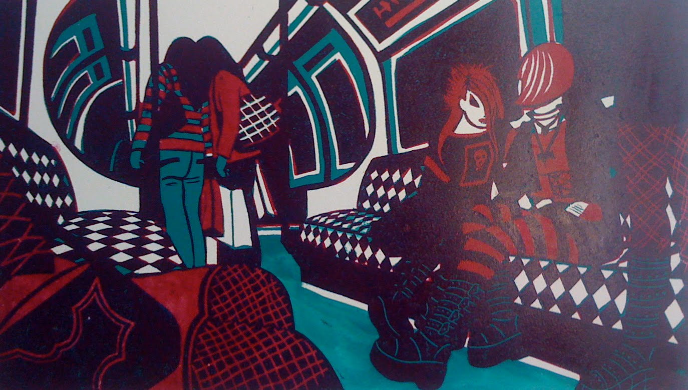
It always happens – I reach a point where I feel I can go no further with a print and so the next step is to edition it. This I do, generally feeling quite pleased with myself…..
Then, with the print finally hanging up to dry, I’ll take a quick look and it’s like a fog has lifted. I suddenly see the mistakes, and worse, all the ways in which it could have been so much better.
By this time, (generally the day after finishing the editioning, but sometimes after a cup of tea) it’s far too late to do anything about it and I just put the prints away in a drawer and forget about them for a while.
Of course, this isn’t possible when the print has featured in a series of blog entries so for now, I’ll do an on-line version of putting it away and just leave a photo of it drying in the studio….
Looking on the bright side though I do have a title – it’s called Two Tribes….

New Print – Rectifying Mistakes (part two)


Here are two proofs, one with a turquoise floor and one with a pale green one.
Of course, once I’d printed them, it was blindingly obvious that what was needed was a dark floor instead.

So then out came the repair kit (stanley knive, super glue, wood filler and sandpaper, in case you were wondering…)
I had to splice in a whole new floor section – from the left is the front view, then the back view and finally, the goth boots drawn back and ready to cut again. A piece of cake, really (joke).


New Print: Rectifying Mistakes (part one…)

I had a problem (sadly, not the only one on this particular print) with the colours for the upholstery on the tube train seats. It’s so difficult to predict what will work best with the surrounding areas and once the blocks are cut, it’s very hard to rectify.
In the end, I printed up little sections with various combinations of the four colours I was using and laid them down over one of the earlier completed proofs.
Here are three examples:

Once I’d decided on the colour combination to use, I had to take the one block that already had the diamond shapes cut into it and offset it on to the other three blocks.
Here’s a very quick explanation of offsetting:
Ink up a block very thickly and print it on paper.
Place an uncut block on the press, lay down the printed paper on top in exactly the same place and run it through the press again.
You then have a perfect impression of the cutting from the original block transferred to the next one. (Apologies if I’m preaching to the converted…)
Below are three random photos of the offsetting as I was going along – the white powder on the first one is talcum powder, which dries the offset ink quickly so you can cut into the block without waiting for the ink to dry.


New print – Third Block

Above is a picture of the third block in the process of being cut and below are two examples of the many proofs I took at this stage.

In this very early proof, I’ve decided to use a pale cool grey, and have left the floor unprintes up until now, so that the grey prints onto the white paper. I’ve also left the seats in turquoise with the crimson creating the diamond pattern.


On this later proof, I’ve decided to change the pale grey on the third block to a pale cream – olive green mixed with white and a lot of reducing medium.
This thins the ink, allowing the previous colours to show through, especially effective over the dark purple, where the two colours produce a warm but neutral grey.
Some of the upholstery pattern on the seats has been cut away on blocks one and two, leaving areas of the pale cream able to be printed onto the white paper. The floor is still pure turquoise.

New Print First Block

Here is the first proof of the first block, printed in turquoise and ready to overprint with the second block (in crimson).
I always make a lot of changes to the first block – for example, I couldn’t choose between whether the floor should be light or dark and in the end, decided on light, to echo the ceiling areas, and so cut the lino away on blocks one and two.
Then I had a change of heart and painted the floor in thinned turquoise ink (you can see this above) as I wanted to check whether a darker floor would create a better balance.

Inevitably, of course, I decided that I needed to re-instate the dark floor and had to insert a new piece of lino into where I had previously cut the whole section away (as you can see in the image above).
I guess I could always cut a whole new block but I find a combination of wood filler, super glue, coarse sandpaper and a lot of cursing does the trick just as well.
(In case you’re wondering, the remains of dark crimson ink on the lino is from when I changed my mind yet again and decided on some off-setting – but more on that later…… )

Drawing at Kings Cross


Kings Cross train station is Grade One listed, although you wouldn’t know it – the building has had a lot of really rubbishy work done to it over the years.
Although it is going to be refurbished soon, it still has a certain grim charm and I wanted to record it before it got tarted up.
St. Pancras station, which is right next door, has had the full heritage treatment- cleaned, buffed and polished to within an inch of it’s life. The result is undoubtedly very beautiful but I think I prefer the rather down-at-heel Kings Cross….

New Print – Progress Proof

This is a quick photo (sorry about the flash) taken of the three blocks printed together, using purple (instead of the original brown), pale blue-grey, and crimson (instead of the original scarlet). The last block has now been cut and I’ll probably print it in yellow and/or orange.
I did think it might be interesting to chart the progress of a linocut being made but actually it’s been a bit repetitive.
Well, I guess I’ll let the pictures speak for themselves…..