New Print – Rectifying Mistakes (part two)


Here are two proofs, one with a turquoise floor and one with a pale green one.
Of course, once I’d printed them, it was blindingly obvious that what was needed was a dark floor instead.

So then out came the repair kit (stanley knive, super glue, wood filler and sandpaper, in case you were wondering…)
I had to splice in a whole new floor section – from the left is the front view, then the back view and finally, the goth boots drawn back and ready to cut again. A piece of cake, really (joke).


New Print: Rectifying Mistakes (part one…)

I had a problem (sadly, not the only one on this particular print) with the colours for the upholstery on the tube train seats. It’s so difficult to predict what will work best with the surrounding areas and once the blocks are cut, it’s very hard to rectify.
In the end, I printed up little sections with various combinations of the four colours I was using and laid them down over one of the earlier completed proofs.
Here are three examples:

Once I’d decided on the colour combination to use, I had to take the one block that already had the diamond shapes cut into it and offset it on to the other three blocks.
Here’s a very quick explanation of offsetting:
Ink up a block very thickly and print it on paper.
Place an uncut block on the press, lay down the printed paper on top in exactly the same place and run it through the press again.
You then have a perfect impression of the cutting from the original block transferred to the next one. (Apologies if I’m preaching to the converted…)
Below are three random photos of the offsetting as I was going along – the white powder on the first one is talcum powder, which dries the offset ink quickly so you can cut into the block without waiting for the ink to dry.


New print – Third Block

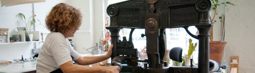
Above is a picture of the third block in the process of being cut and below are two examples of the many proofs I took at this stage.

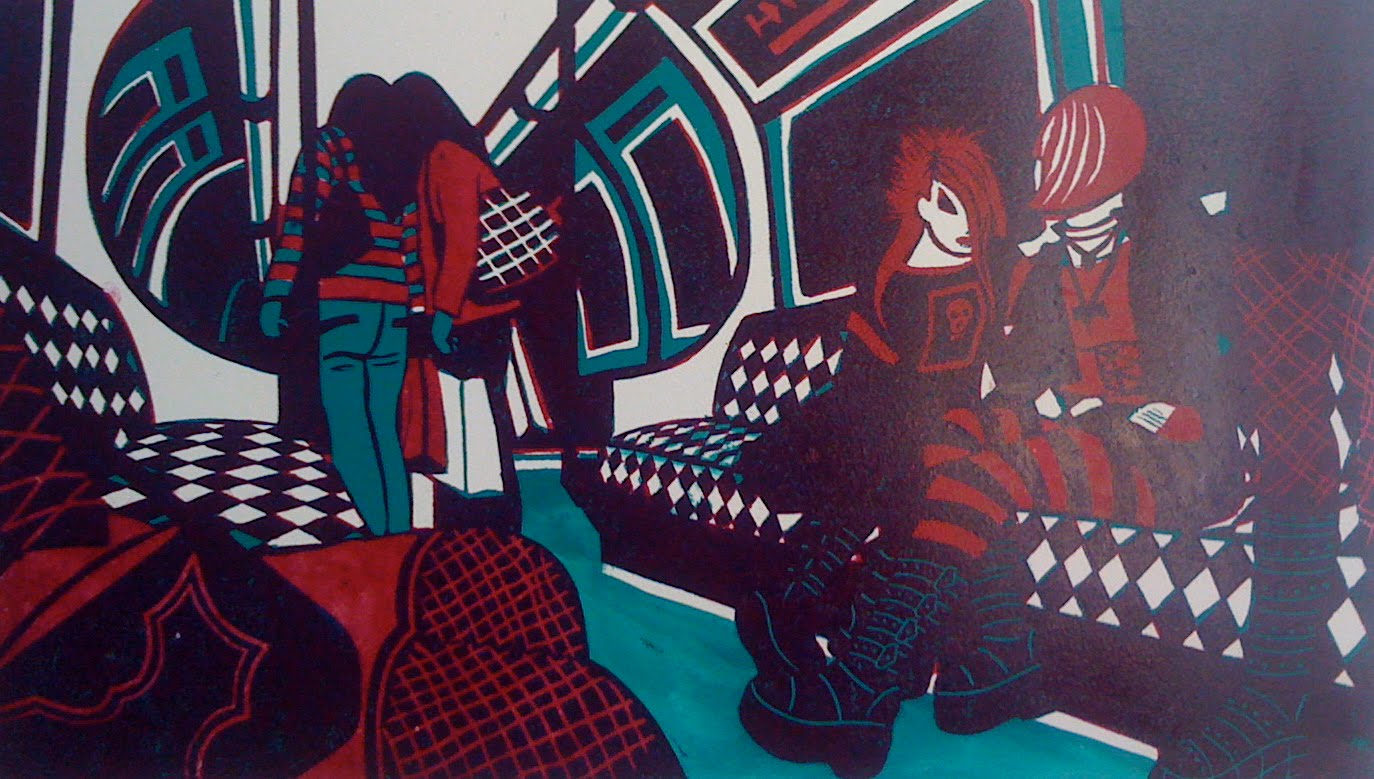
In this very early proof, I’ve decided to use a pale cool grey, and have left the floor unprintes up until now, so that the grey prints onto the white paper. I’ve also left the seats in turquoise with the crimson creating the diamond pattern.


On this later proof, I’ve decided to change the pale grey on the third block to a pale cream – olive green mixed with white and a lot of reducing medium.
This thins the ink, allowing the previous colours to show through, especially effective over the dark purple, where the two colours produce a warm but neutral grey.
Some of the upholstery pattern on the seats has been cut away on blocks one and two, leaving areas of the pale cream able to be printed onto the white paper. The floor is still pure turquoise.

New Print First Block

Here is the first proof of the first block, printed in turquoise and ready to overprint with the second block (in crimson).
I always make a lot of changes to the first block – for example, I couldn’t choose between whether the floor should be light or dark and in the end, decided on light, to echo the ceiling areas, and so cut the lino away on blocks one and two.
Then I had a change of heart and painted the floor in thinned turquoise ink (you can see this above) as I wanted to check whether a darker floor would create a better balance.

Inevitably, of course, I decided that I needed to re-instate the dark floor and had to insert a new piece of lino into where I had previously cut the whole section away (as you can see in the image above).
I guess I could always cut a whole new block but I find a combination of wood filler, super glue, coarse sandpaper and a lot of cursing does the trick just as well.
(In case you’re wondering, the remains of dark crimson ink on the lino is from when I changed my mind yet again and decided on some off-setting – but more on that later…… )

Edition sizes

What size should a print edition be?
I guess the question could be – how can you make a living if you only produce prints with small editions? After all, the major costs are at the beginning – the time it takes to come up with a working drawing, then the numerous proofs – all that ink and paper – and then the editioning costs themselves….
A small edition size of say thirty, might not be practical when sending out a new print to a number of commercial galleries (as most professional printmakers do) as you could very quickly run out of stock . And, of course, at this stage you may well not have actually sold any…
Small editions only work if you produce your prints quickly and prolifically and then by only using one lino block, etching plate, etc. Using several blocks, as I do, rather rules this out, as producing a multi-block lino is time-consuming and painstaking work.
I recently lowered my edition numbers from 100 to 75 after much internal debate – partly as I get really fed-up printing my editions up to 100 but also because some collectors won’t buy prints from large editions
One issue with this though is that to counteract the reduction in sales opportunities I should really raise my prices by 25% – the problem is that some (or most?) buyers may not appreciate the distinction…..